Refuge Huntington Beach
Identity, print/digital/environmental design, apparel
Revitalizing the voice of a vibrant beach church in “Surf City USA”, while paying homage to its SoCal-casual roots.
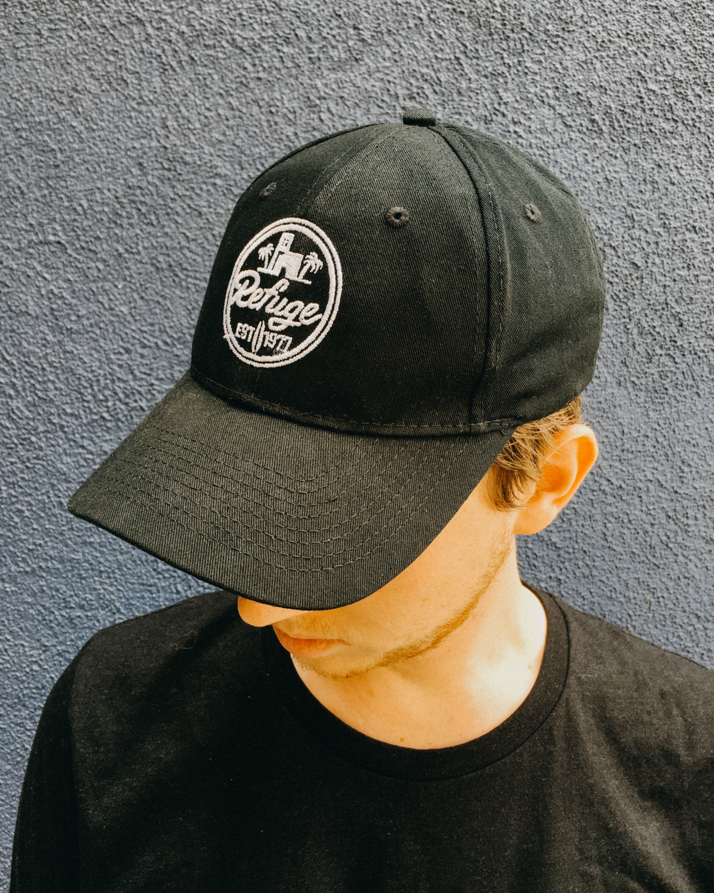
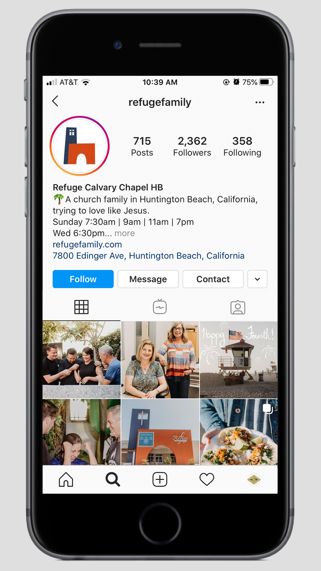
Where previous logos and identifiers at Refuge only explored type marks with the church’s full name or use of the “Refuge R”, this new identity seizes on the church’s instantly-recognizable, iconic “tower and arch” facade; a local landmark placed at the bustling crossroads of a popular urban district.
With its priorities less in cohesive brand identity and more in fostering a strong culture of family, the church had chased a number of graphic design fads since its founding in 1976, cycling through iteration after iteration. New identities were layered on top of old, resulting in a disjointed experience. With this brand refresh, a key objective was to find a timeless look that drew from a balance of both local and Refuge culture.
Refuge Signature 2019: Hand-drawn typeface created custom for Refuge, seeks to emulate classic surf-culture calligraphy, speaking to a youthfulness, vitality, and warm sense of family.
California Gothic: Open-source recreation of the typeface found on the California state flag, serves to balance the playful with an air of proud tradition and rich heritage. (credit: Matt Lag)


